Icon Fundamentals
Icon importance
Your icon is arguably one of your most important assets when it comes to your App Store presence. It is usually the first opportunity to impress potential customers and therefore makes it critical to your overall branding.
When speaking about icons, there is without a doubt some best practices that should not be ignored. Often when we think of icon design, less is usually more. However, the icons main purpose is to fully encompass and capture the very essence of your game.
Ideally, this should be achieved with as few elements and colours as possible. The best rule of thumb, and at the very core of great icon design, is that you should try and head for a single element that is clearly visible when viewed on the device itself.
So let’s go through some best practices and what to keep in mind when designing your icon.
A single element & keep it simple
Games like Monument Valley execute this particularly well. Whilst they have stunning artwork throughout the game, they focussed entirely on the character and single platform.
Another great example of the would be Canabalt. The single Pixel character running shows you exactly what to expect from the game.
Limit your colour palette
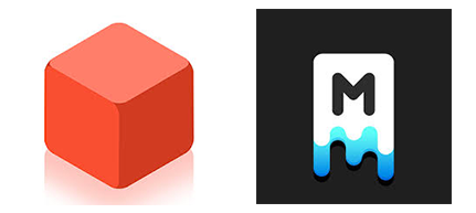
Whilst your game may be super colourful, it’s important not to over complicate your icon, try and pair back where possible. GramGames hit game 1010 has done a great job of this.
They could have chose to include many of the pleasing colours, but opted to focus on the single red cube.
They also did something similar on their massive hit Merged. The simple tricolour icon is really effective and works particularly well.
Avoid Using Words
Using words on your icon is generally a bad idea as they’ll be particularly hard to read once the icon is scaled down. It’s also mostly redundant as the name of your app is sitting right next to it on the App Store listing.
Most bigger brands tend to either use the first letter of their company or just their logo as part of their overall branding, but generally speaking you see this rarely in the gaming categories.
The Walking Dead for Instance have chosen to use the title on their icon, as have Rockstar Games with Grand Theft Auto, but these are huge companies with a massive marketing machine in place, here the names and franchises themselves are instantly recognisable and quite honestly, their icons are way less of an important factor.
Avoid Using Photo’s
This is usually more common in the Photo & Video Categories, where it could make more sense, but it’s still a bad idea. Photo’s are non scalable and often will contain unnecessary details.
The only exception could be for celebrity endorsed games where it makes sense to show the Famous Star to sell the game.
The approach GLU took for example, is way better solution, here they used a realistic illustration rather than traditional photo.
How To Fail
Being consistent with your icon and aligning it closely to the artwork within your game, is a really good way to gel everything together. This also ensures it wont disappoint the user once downloaded. The last thing you want, is for a user to click on your icon only to discover that your game screenshots don’t match up with the promise on your icon and is essentially a different game altogether. Lets first take a look at a couple of examples, to explain this further.
Going by the exciting Icon, I’m ready to download and I want to have a look at the game screenshots.
So as we can see, the game does not reflect the icon in anyway whatsoever and looks absolutely terrible. As a potential customer I’ll be giving this a big miss, so even though the icon grabbed my attention and I clicked through to the product page, I am now feeling let down. Fail!
Of course this an extreme, albeit sadly all too common example, it does I think show exactly not what to do and something to keep firmly in mind when designing your icon.
How To Succeed
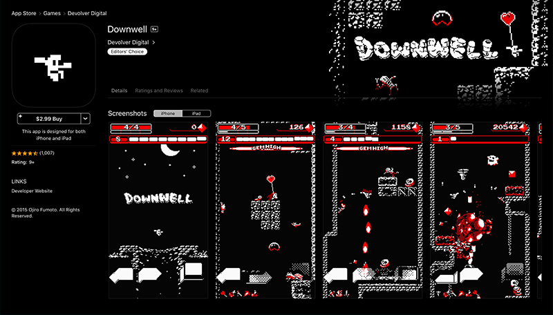
Downwell is a perfect example of successfully using the games art style for the icon.
Revolver Digital has produced a cohesive marketing suite that truly brings the essence of the game throughout all it’s assets.
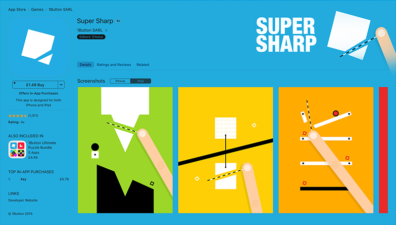
Super Sharp from 1buttonSarl have also done an incredible job of pairing back their icon and matching it to their in game art style.
The simple cut effect on the white square against the blue background, sets expectations perfectly, and once inside the App Store product page, it really feels solid and fully connected.
This is definitely one of the factors that the App Store team look for when viewing a game and considering it for a feature place, and especially a key ingredient for snagging a banner feature.
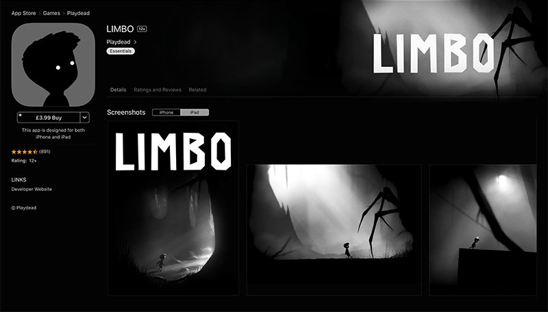
Limbo is by far one of my all time favourites and its no surprise Limbo is continually re-featured time and time again and has truly earned its place in the App store hall of fame.
Apart from being a great game, Playdead did an absolute stunning job of capturing the games atmosphere and intrigue, then wrapping it all up in a shockingly simple icon.
The Importance of Scalability
So it’s super important when designing your icon, to ensure that all testing should be carried out by viewing the smallest sized version. Although your icon may look stunningly great at its largest resolution, the reality is that your customers will only ever see the icon on an iPhone or iPad.
We built our Icon Tester for this very purpose.
Once your icon is ready, you simply either drag it directly onto the ‘upload icon’ button, or open up a finder window to browse for your icon image. This will take a little while to process and your icons must be in either .png or .jpg format.
Once the upload is complete you will see your icon displayed. As you scroll down the page you will see;
We built Icon Tester Pro for this very purpose. Once your icon is ready, you simply either drag it directly onto the ‘upload icon’ button, or open up a finder window to browse for your icon image. This will take a little while to process and your icons must be in either .png or .jpg format.
Once the upload is complete you will see your icon displayed. As you scroll down the page you will see;
- Large size icon displayed on different background shades.
- How our icon will look on the App Store product page on both iPad and iPhone.
- Viewed on the homepage of both devices, in the Category Section of the App Store.
- How it will appear in the Top Charts section of the App Store.
- How it will look on the Homescreen.
You can either drag one of your icons directly onto the upload icon button, or simply click the button and that will open up a finder window for you to browse.
Uploading icons does take a little while to process, and your icons must be in either .png or .jpg format.
The first 3 views will give you an indication of a large size on different background shades. Underneath you’ll start to see the more relevant sizes, the first one being how your icon will look on the App Store product page on both iPad and iPhone.
You’ll also see the homepage of both devices, the Category section of the App Store, Top Charts section and finally on the App Store homescreen.
Getting Feedback
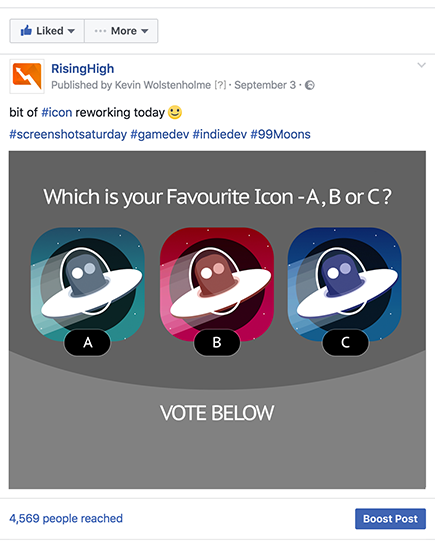
Getting early feedback on your icons is also a great way to see how effective your design is looking. Facebook can work extremely well for this, we do this everytime before launching.
Whilst you can post to any game or Developer Groups you may belong to, I wouldn’t rely solely on these as they are obviously filled with other developers who are generally not your target audience.
We always post to our Company Facebook Page, you can also use your personal profile too and this will attract more of a widespread audience.
You may want spend $10-20 boosting the post if necessary and run it until the boost runs out. If you’re familiar with Facebook ads, you could also use advanced targeting to really hone in on your ideal demographic.
There are also sites where you can go way deeper for really detailed stats such as:
http://www.optimizely.com
https://www.storemaven.com
http://testnest.co
These do tend to be quite pricey and I’ve never used any of these personally, as I found Facebook to work well enough to see if we’re on track or not.
So do not under estimate the value of your icon and its importance when pitching, especially to Apple. Although I have no firm evidence on this, it is said that the App Store team will take all the Icons from the games that have a chance for a feature place that week, and line them up side-by-side.
They begin to discard any that do not meet their standards, or that simply do not stand out enough to be noticed. How much, or if any of this is true, I’m not sure. But if we put ourselves into the shoes of an App Store Editor once again, this doesn’t sound too unreasonable and a pretty logical way of doing things. Once a week they’ll have to choose the line up, and games will either go in the list or out.
Although a bad icon alone is unlikely to fully hamper your chances, it should be an important part of your process. It’s one of the things that is within your power to control, and you should be heading to create a striking Icon to give you the very best chance of making the list.
From personal experience, and as you’ll begin to notice as you delve deeper into your research tasks, the vast majority of featured games in any given week, will all have an extremely strong and clearly defined icon.
Summary
Best Practices of Icon design and why by following these few golden rules, you can keep your icon on track and effective as possible.
Why Keeping Consistency is a highly effective and proven method, especially when viewed alongside your screenshots, and can really deliver a fantastic marketing suite.
The Importance of Scalability, and how you can use our Icon Tester tool to get an overall view of how your final icons will look on the App Store.
Most importantly here, is to view your icons on the devices themselves, rather than the larger sizes.
How by A / B testing and Getting Feedback on Facebook, you can gain valuable early insights, and perhaps even choose a version that you felt to be your least favourite option.
Action Points
• Identify Key Elements in Your Game
Take a look at your game and pick out 3 key elements that really sum up your main gameplay and theme. Using a character or common element usually works best as we’ve already discussed. Mock up each element to decide which is most iconic.
• Create 3 Different Colour Versions
Look for the strongest colours in your game and create 3 separate versions of your icon. Keep the main design intact, this is purely to test your colour combinations. Bold, vivid colours tend work best and ensure they really stand out.
• Post on Social to Gather Feedback
Create a post on your favourite Social Platform, we use Facebook as discussed earlier, and display all 3 different versions in the same post. This should be a single piece of artwork and then ask the community for feedback.
Show all the colours next to each other and keep the question really simple. This should be something like A? B? or C? I’ve included the photoshop template file below for you. This can be easily modified to suit your needs.